Typography
-
SUPER VISION uses both NEXT by Ludovic Balland and Monument Grotesk by Kasper-Florio in a limited palette of weights and variants.
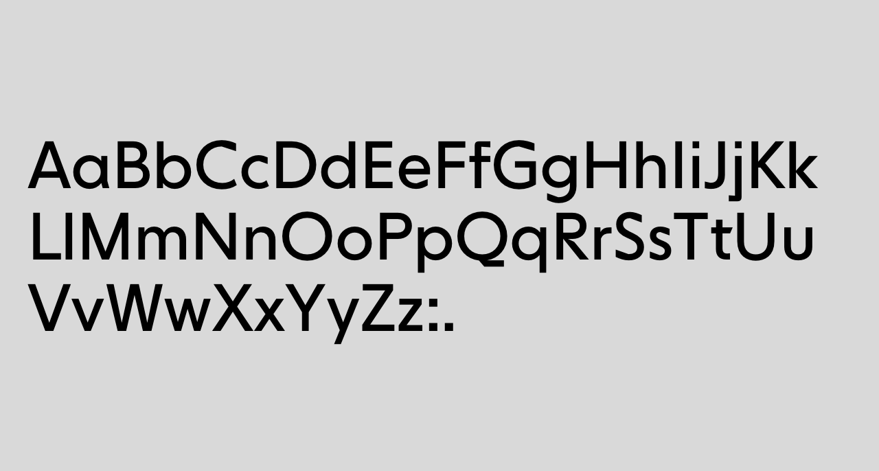
Brand font: NEXT
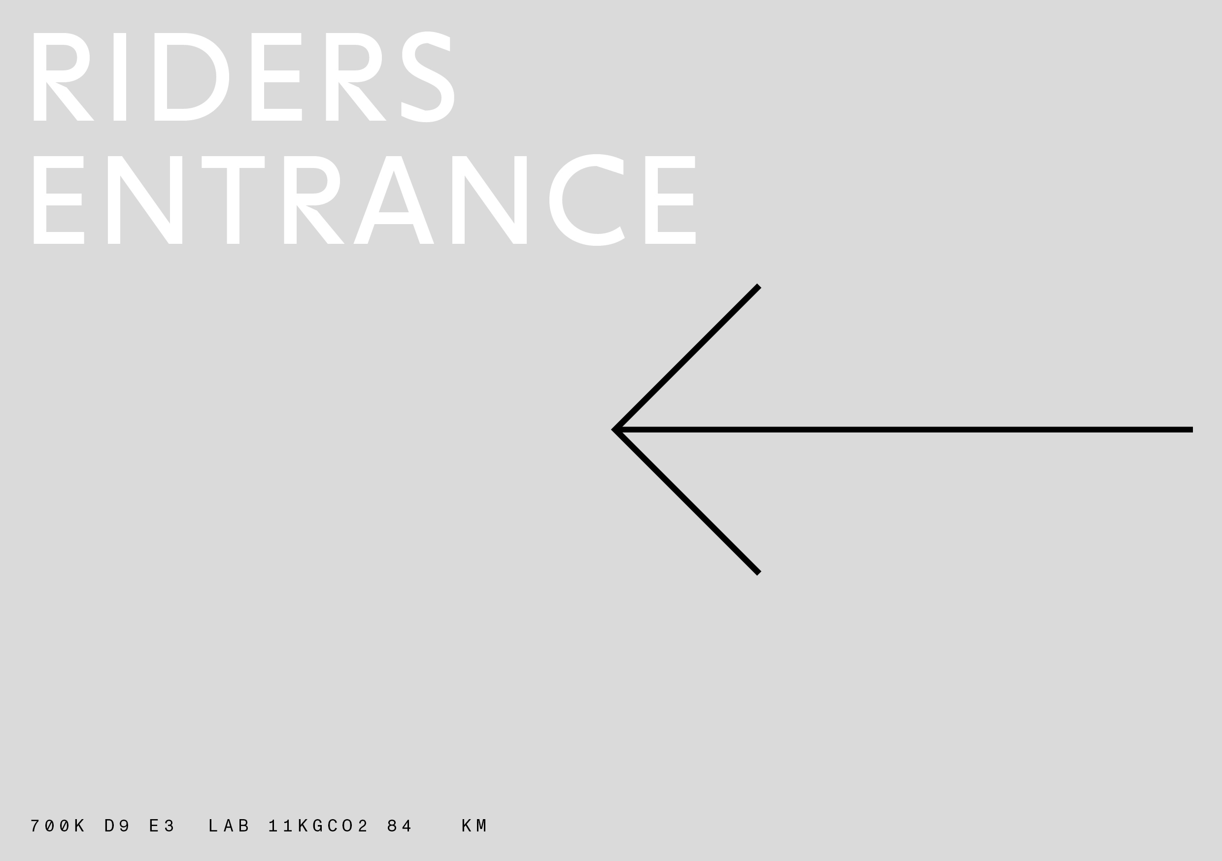
NEXT (in the book/regular cut) defines the SUPER VISION wordmark, lending a futuristic flair to the brand. It is also used for large-scale headlines that need to communicate a message or direction clearly.
NEXT Book Regular Usage rules for NEXT
- NEXT is exclusively used capitalized, avoiding the extreme expression of some lower-case letters in the typeface.
- Apart from the wordmark, NEXT is only used for a specific task: boldly communicating or announcing information: As a headline font on a poster or as a prominent guide in a signage system.
- When used for headlines in this way, NEXT is used as similarly as possible to the wordmark: If we want to shout about something, we really shout about it.
- NEXT is never directly combined with Monument Grotesk.
NEXT defines the SUPER VISION wordmark, lending a futuristic flair to the brand. It is also used for large-scale headlines that need to communicate a message or direction clearly.
-
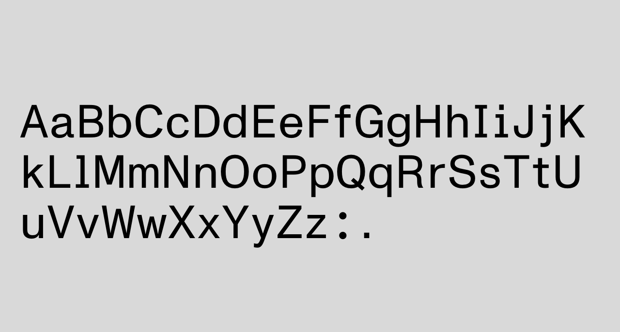
Content font: Monument Grotesk
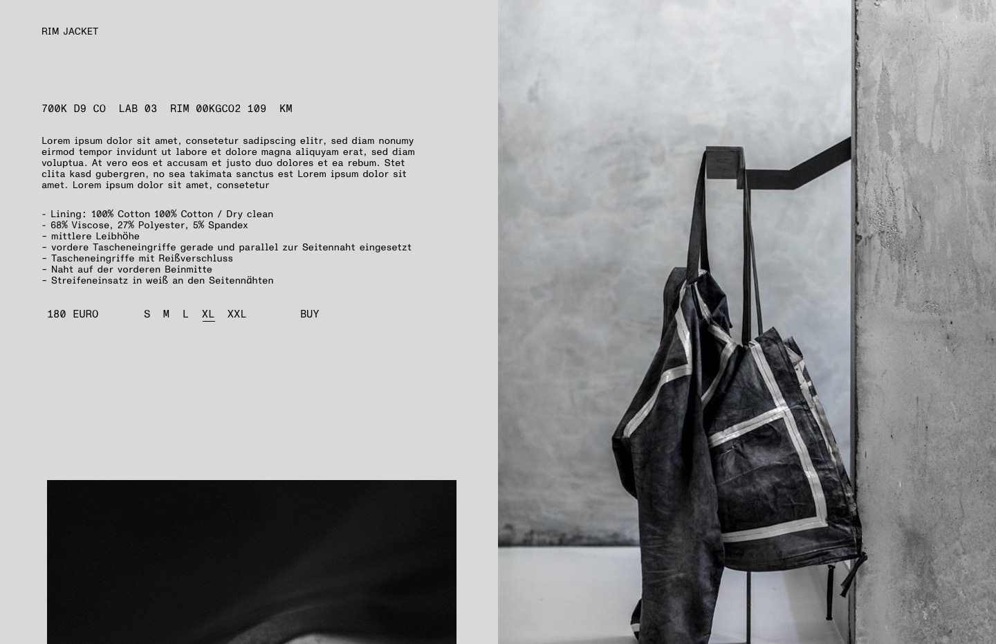
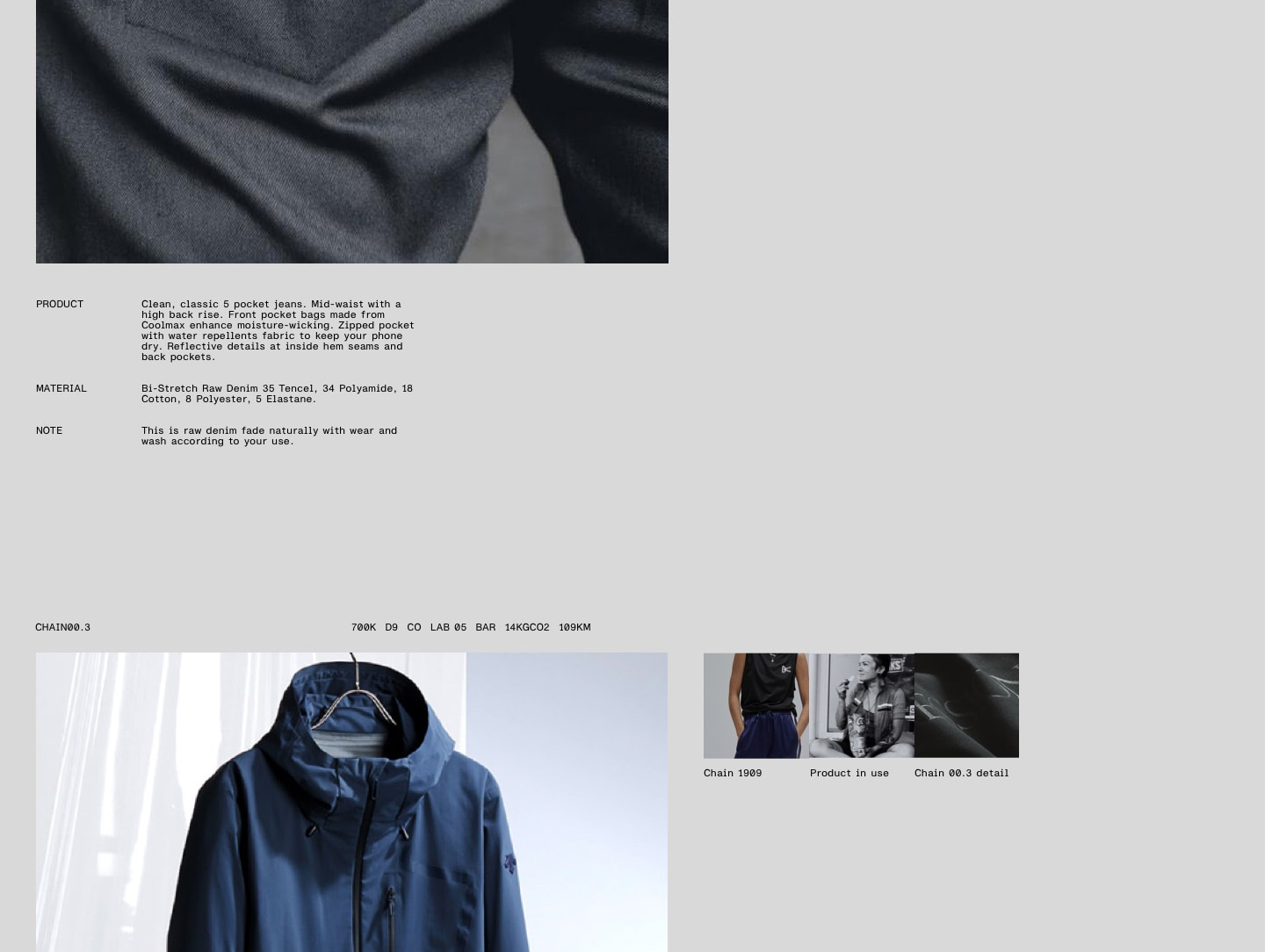
Monument Grotesk is the primary font for content. It is used exclusively in its semi-mono and mono variants. Monument Grotesk represents the brand’s industrial nature and is the basis for the Info Block, one of the brand’s core elements. To avoid falling into tired cyberpunk or techwear tropes, the semi-mono variant is used for all text content. It displays an even, approachable character that is more welcoming and human.
Usage rules for Monument Grotesk
- Monument Grotesk is exclusively used in its semi-mono variant.
- The only exception is the Info Block, which is set in Monument Grotesk mono, to fully support its monospaced appearance.
- Per document, the font should be used in exactly one font size, including headlines. Based on an A4 sheet of paper,
10ptwould be an adequate font size. - True to our commitment to simplicity, there is only one headline style in running texts set in Monument Grotesk: Headlines are set in capital letters.
- To emphasize text, we adapt the style established in the impact line – using horizontal rhythm rather than font sizes or font weights. This also may include separating headlines horizontally instead of vertically.