Brand components
-
Introduction
In general, SUPER VISION is a stealthy brand. In our single minded focus on product quality, we feel distracted by loud branding. At the same time, we are proud of who we are, and we want to state our name subtly but clearly – nothing more, nothing less.
-
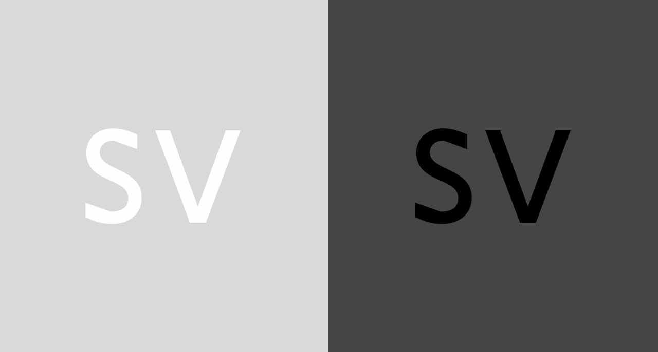
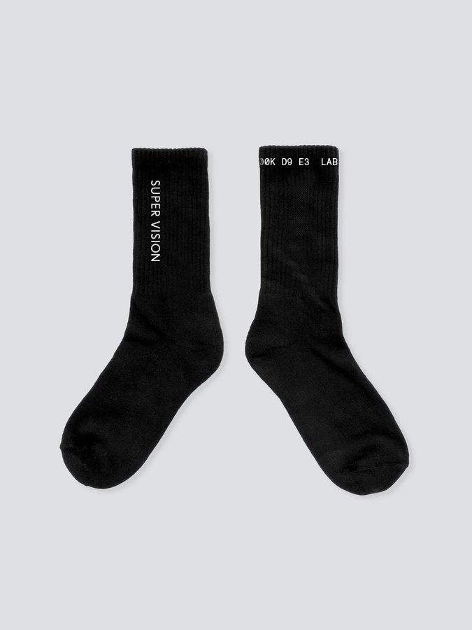
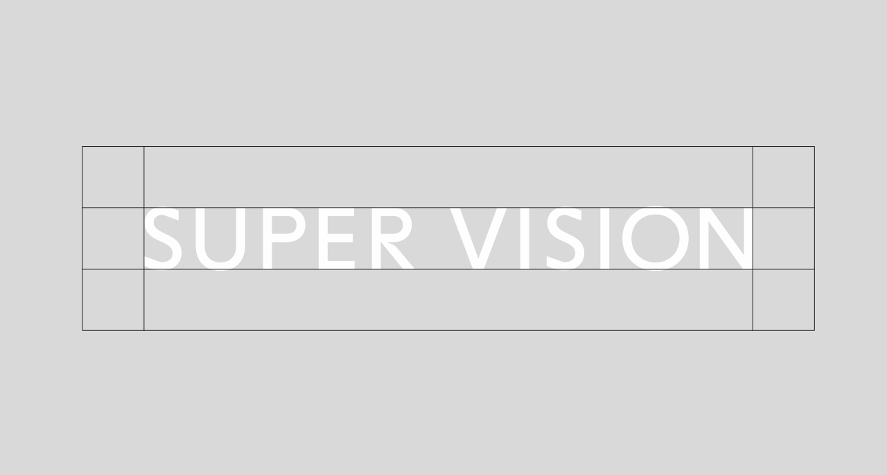
The Wordmark
Rules
- The SUPER VISION wordmark is never angled, skewed or rotated. It is always perpendicular to the primary orientation of the layout.
- The wordmark is always set in white, on the Concrete colored background outlined in the Light and shadow principle.
- The wordmark is always set centered relating to the document.
- The wordmark commands a safe area that is equal to its own height in all four dimensions.
- For very small appliances (avatars in social media, on-garment press buttons), the compact version of the wordmark should be used.

Exclusion Area
The exclusion zone is equal to the height of the wordmark.
The Compact Wordmark
Used for social media and whenever space is limited. If possible, The Compact Wordmark should be set on a brand-conform background color, i.e. Concrete or Asphalt.
-
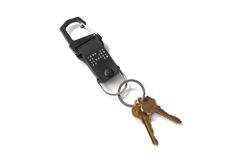
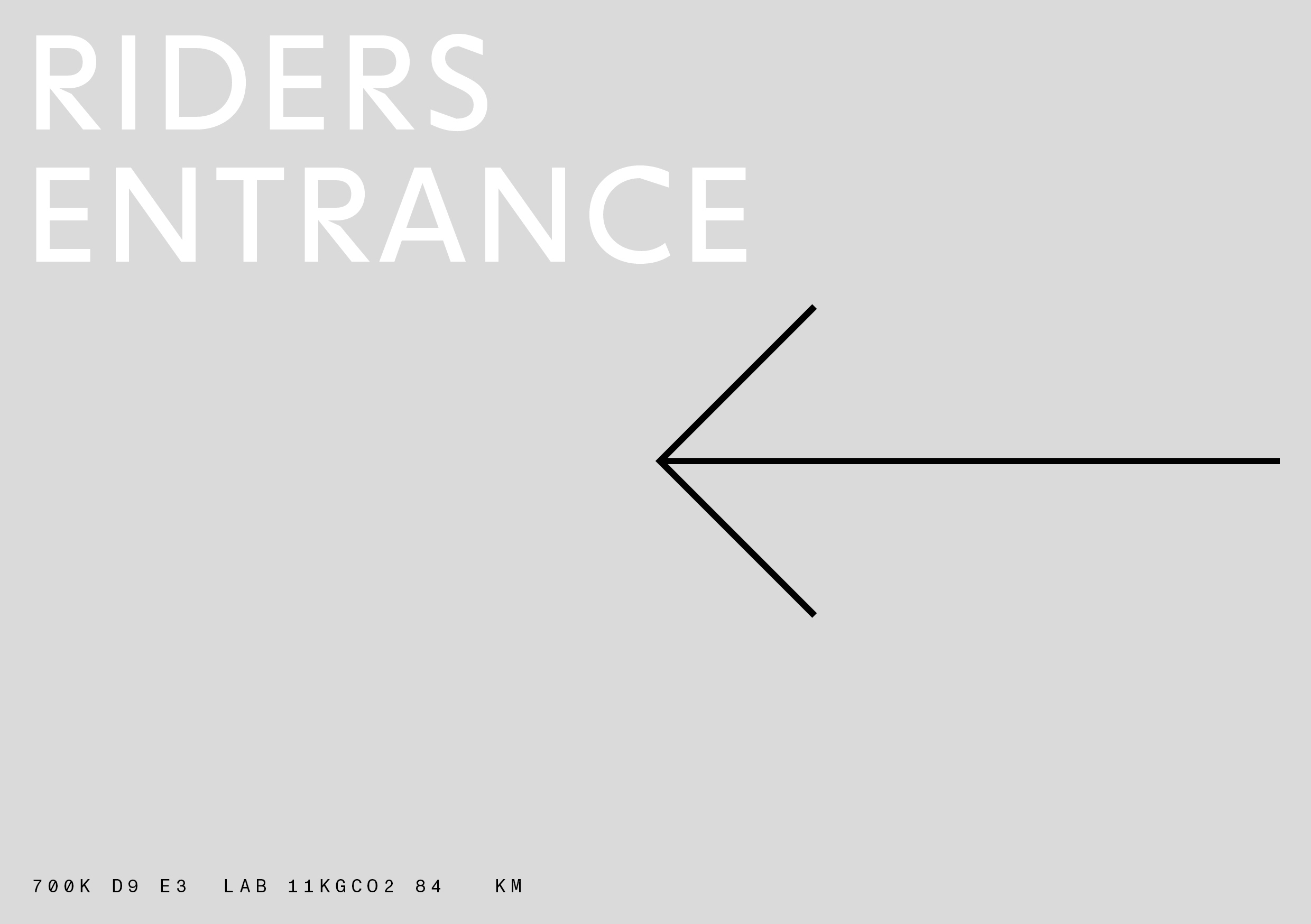
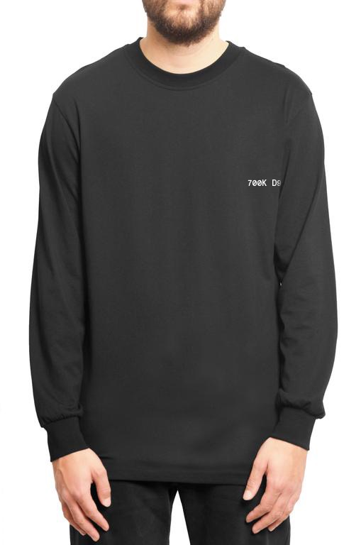
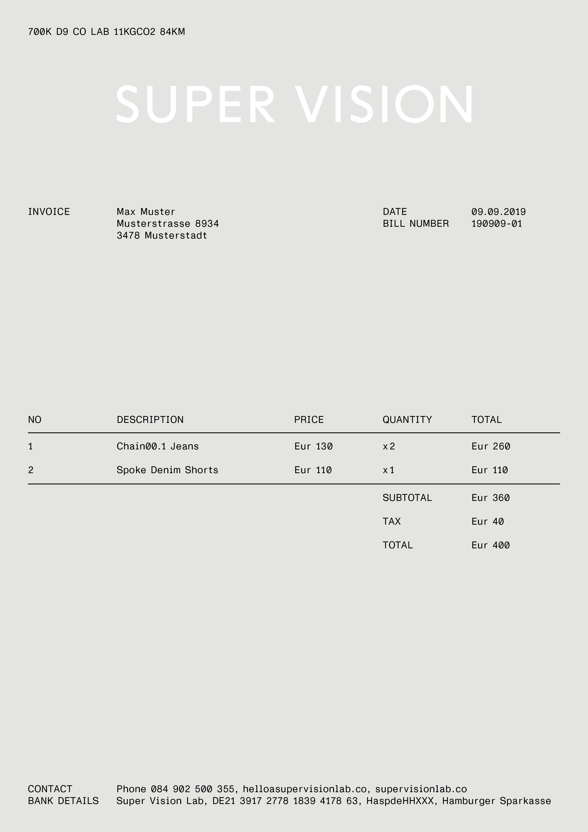
The Impact Code
The Impact Code is not a logo. Still, it compresses everything we stand for into a compact, high-density statement. It acts as a reminder to our responsibility as makers of things. Therefore, everything that leaves our hands is signed off with the code. This means that every product, every brochure, every website, every fair booth states its origin, its CO2 impact and the number of cycled kilometers to offset this impact.
There are two variants of the Impact Code:
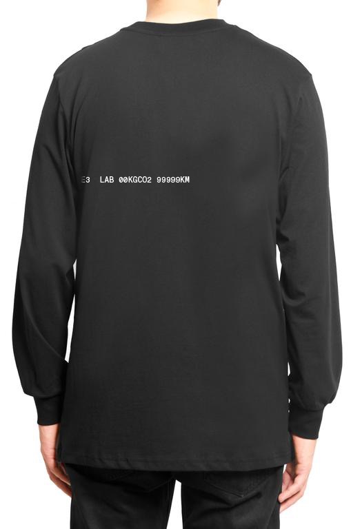
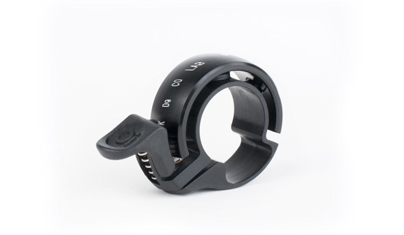
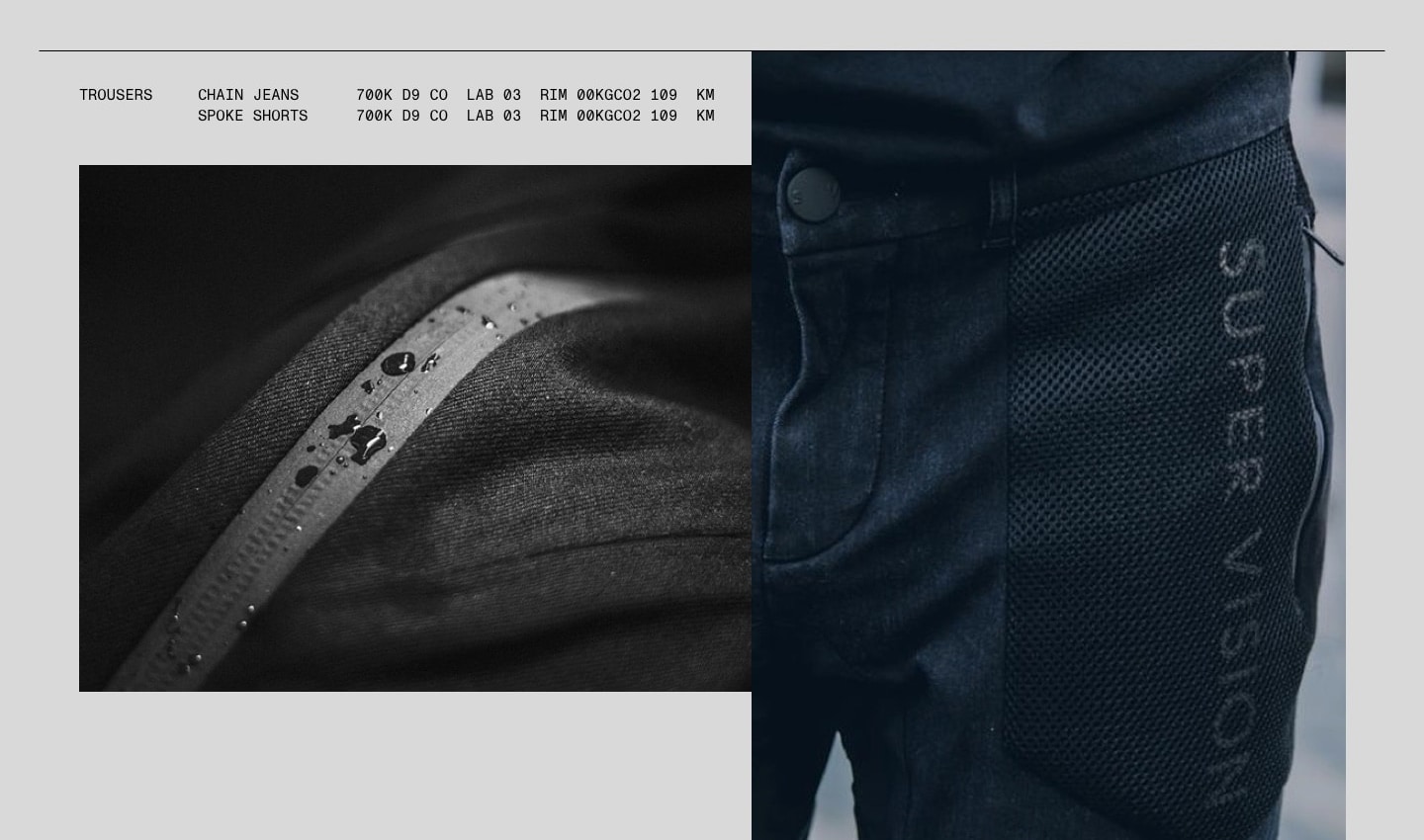
- The Impact Block, used to tag SUPER VISION products – garments, bags, accessories
- The Impact Line, used to tag marketing material and anything that is not a product that can be purchased from us.
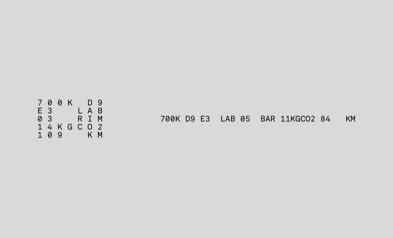
The Impact Block
Line Content Info Code 1 Designer/collabo SUPER VISION, collaborator SV X CB 2 City Zip code 700K D9 3 Place of manufacture Factory name E3 LAB 4 Product ID Edition & Product name 05 BAR 5 Emissions CO2 emission in KG 00KGCO2 6 Offset Distance in km 99999KM Rules for using the Impact Block
- The Impact Block is used to tag SUPER VISION products. It is printed or affixed otherwise to every product.
It should be set corresponding to the document’s base font size (see Typography section), never smaller or larger, with10ptbeing the default size. Characters within the Block are separated by a blank space. - Its placement should be clearly separated from other content elements. The block is a very edgy element that does not combine well with running text or image grids. Therefore, it should command its own space – be it separated by white space or using a different side of the same document: the backside of a sheet of paper, the lateral side of a box or similar.
- Its placement should not be too prominent. It’s a thoughtful sign-off, not a bold branding move. Appropiate positions on garments could be: printed on the inside front of a jacket, printed on a jacron affixed to the inside of a pair of jeans, printed on the inside lower front of a T-Shirt – oriented in such a way that it is readable to the person wearing it.
The Impact Line
Rules
- The Impact Line is used to sign media, marketing material and anything else that is not a SUPER VISION product.
- It should be set corresponding to the document’s base font size (see Typography section), not smaller or larger.
- Its placement should be clearly separated from other content elements. The Impact Line should never turn into a text block. It should always be conveyed as a single line of text, by itself.
- It may set corresponding to the wordmark or used as a subtle branding cue by itself.
-
The colors
SUPER VISION is not a monochromatic brand. We strive for a muted palette, to remain subtle and in the background. At the same time, we do not eschew vibrant highlight colors if a piece of content or a design element warrants the attention.
-
- Black
- #000000
- R0 G0 B0
- C0 M0 Y0 K100
-
- White
- #FFFFFF
- R255 G255 B255
- C0 M0 Y0 K0
-
- Asphalt
- #4A4A48
- R74 G74 B72
- C0 M0 Y0 K0
-
- Concrete
- #D9D9D9
- R217 G217 B217
- C0 M0 Y0 K0

Concrete is exclusively used for backgrounds. White is used as the highlight color, as outlined in Light and shadow. Typography and layout elements should never be set in any other color than black or white.
Highlight colors
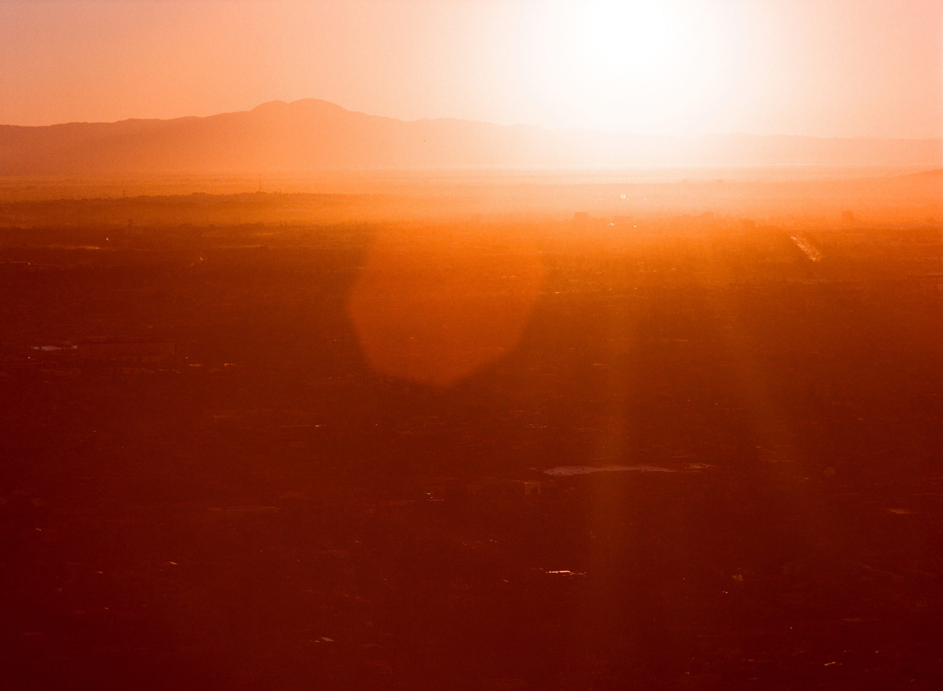
We introduce color and diversity into our corporate design by using a wide range of photography extensively. As outlined in the Layout section, photography collages may be used to create muted backgrounds. At the same time, single, colorful photos may become front and center. When doing the latter, SUPER VISION prefers clear, high-vis colors that strongly separate themselves from their background.
-