Light and shadow
-
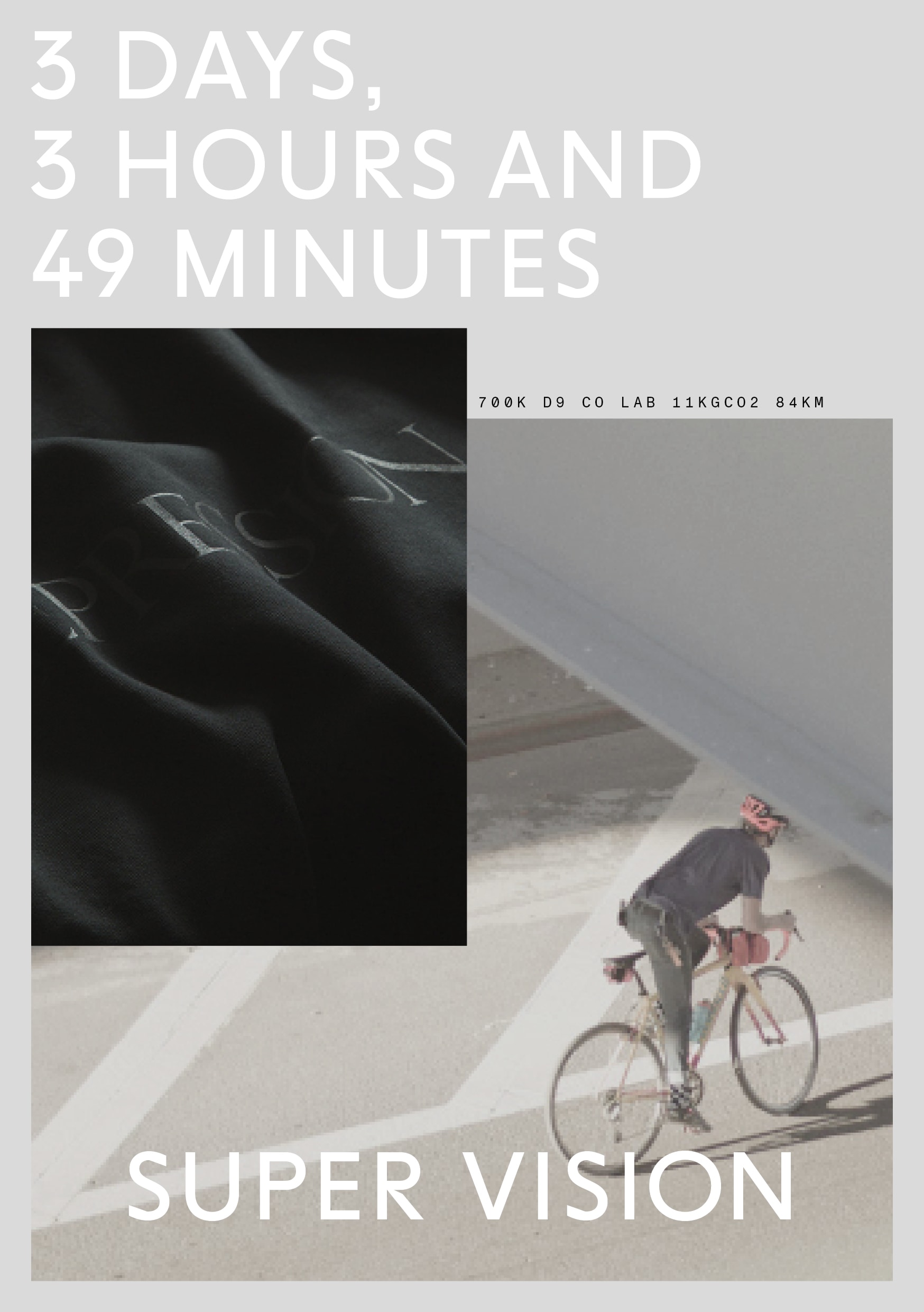
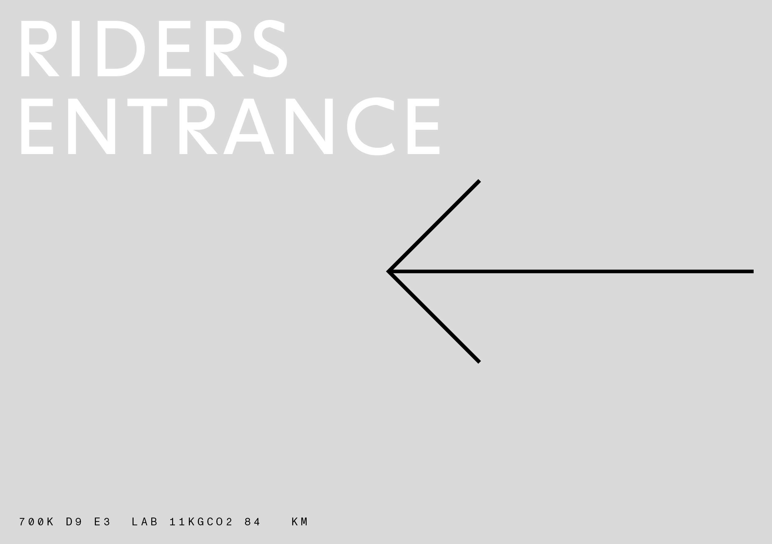
There is an overarching principle guiding the SUPER VISION corporate design. We call it Light and Shadow. It informs our graphic design in a number of different ways. The general principle is based on the idea that we usually want to highlight specific aspects of a layout or a visual – it is part of our single-minded focus on what is essential.
To achieve this goal with the simplest measures possible, we adopt the following principle:
- We default to a medium grey background (defined as Concrete at
15%black, see Color section for details) in all media. - This allows us to use white as a color to highlight focal elements: our wordmark, typography, individual photos.
The visual effect of using white on a muted background allows for a subtle perceived luminance that echoes the reflective tape on SUPER VISION garments. This principle is aided by specific ways of treating photos and working with layout grids.
On special occasions, we may choose to flip Light and shadow to Shadow and Light, adopting an inverted scheme to become even more subtle in darker environments.
- We default to a medium grey background (defined as Concrete at