Layout
-
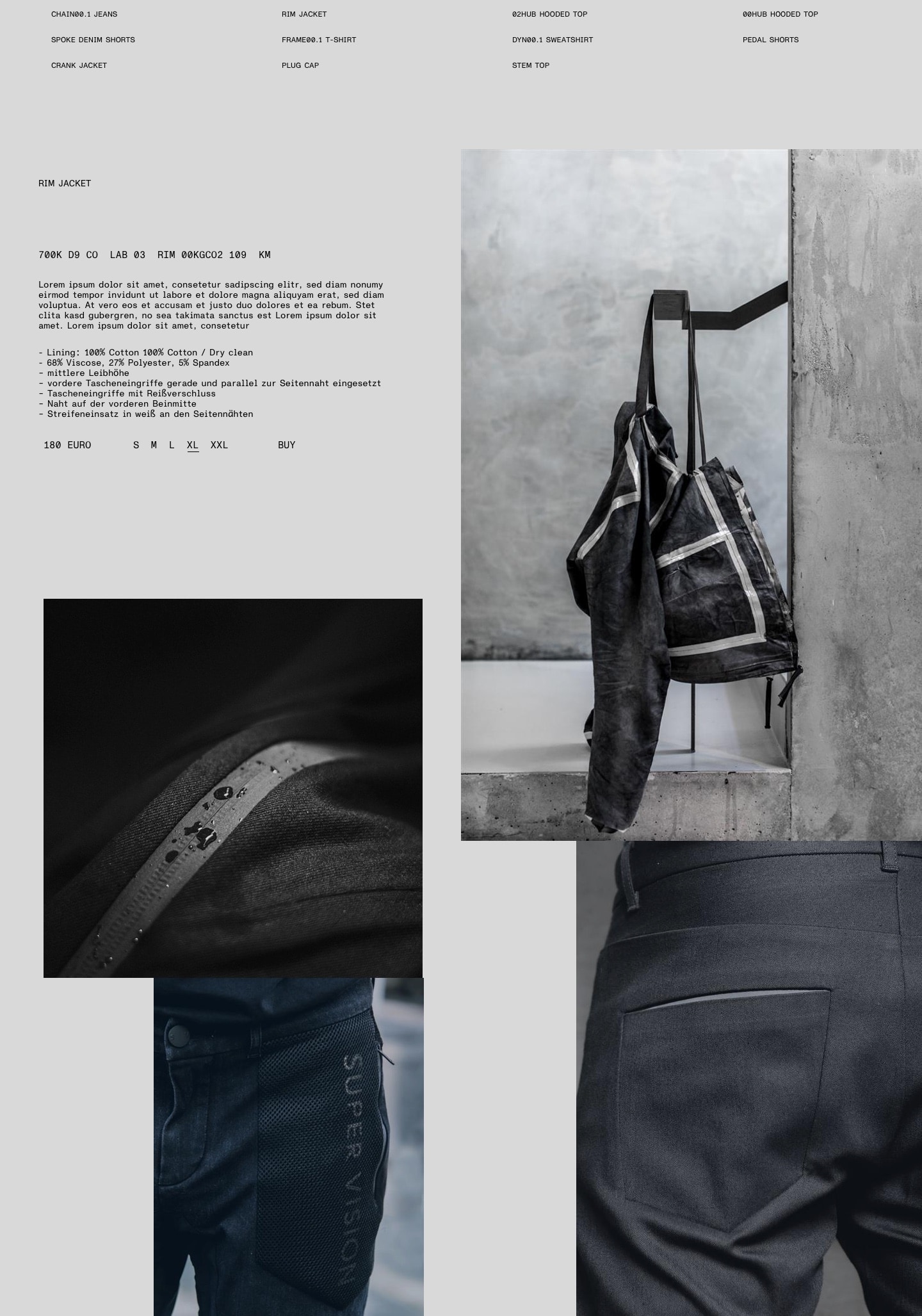
The layout serves a crucial task for SUPER VISION: it brings together very diverse photography, mediates between extreme font hierarchies and brings the approach of Light and Shadow to life.
To keep our layouts simple, we generally strive to separate text content and visual content. In our single-minded focus on the essential, we want to enable our audience to either take in visuals or read information.
As outlined in the typography section, we do not feel the need to guide our audience – we trust them to decipher the essential facts themselves. We fiercely believe in their intelligence. We do not believe in marketing.
To achieve a consistent layout, we use a combination of two grid systems that can be superimposed on top of each other. They correspond to the principle of Light and Shadow outlined in the intro to this guide.
That said, the layout grids are tools designed to help achieve the SUPER VISION look quickly and easily. Wherever they constrain and hinder progress, they should be ignored and replaced by sound judgement. See also The grids in very small formats.
The Shadow grid
- The Shadow grid uses the complete document format, full bleed.
- It is suitable to arrange photos or other larger-scale elements. It should not be used for typography.
- The number of columns should correspond to the size of the format. In general, the Shadow grid dissects the available space rather roughly – it defines fewer modules than the Light grid does.
- Within the grid, white space should be considered thoroughly. We are looking for a constructivist, almost architectural impression that relates to the full-bleed arrangement of images. Filling the gaps between images helps us create defined, dynamic white space
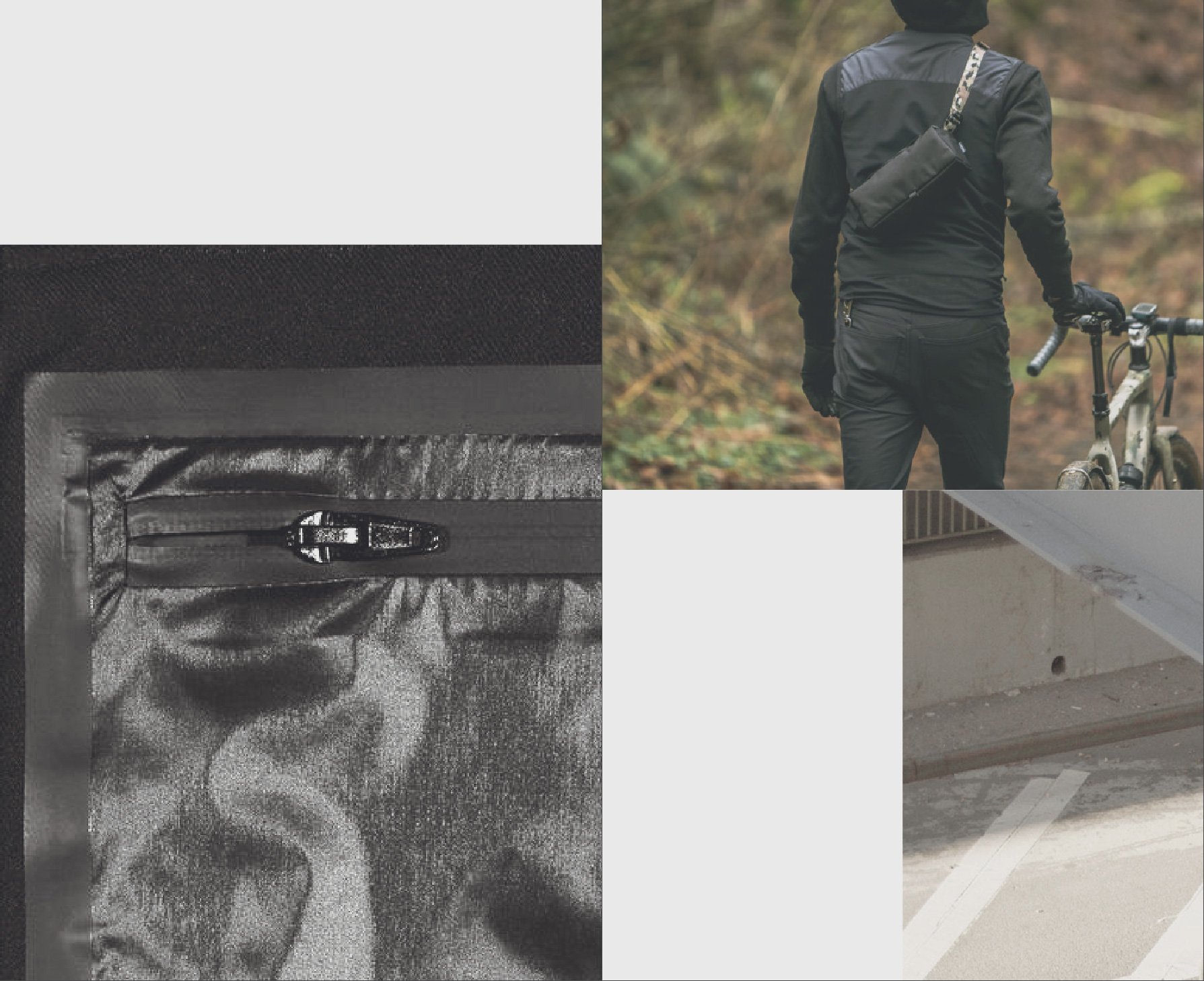
Layout example placed entirely on the Shadow grid 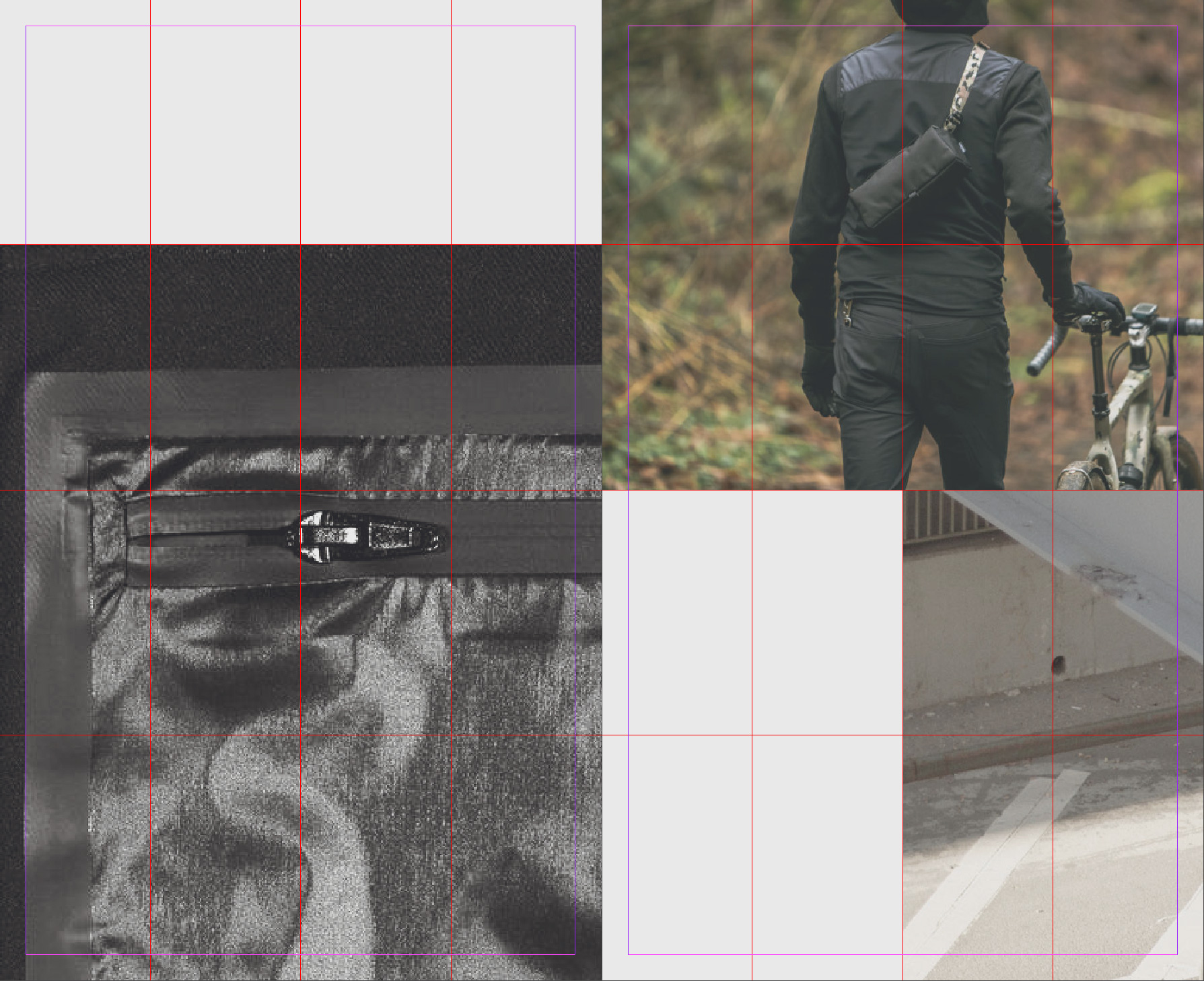
Shadow grid visible to clarify distribution of elements The light grid
- The Light grid is the secondary grid layer, used to highlight layout elements.
- It may be superimposed on the Shadow grid to create strong juxtapositions that form the core of SUPER VISIONS visual language.
- The Light grid is set with a margin towards document boundaries. It provides rhythm to the typography of any layout. The margin also ensures that any photo placed within the Light grid will stand out from its background.
- In contrast to the Shadow grid, the Light grid is slightly more complex – composed of a greater number of modules. It should bever become fragmented or overly detailed. For reference, it should use about 1.5 times the columns the corresponding Shadow grid does.

Layout example of an image placed within the Light grid. 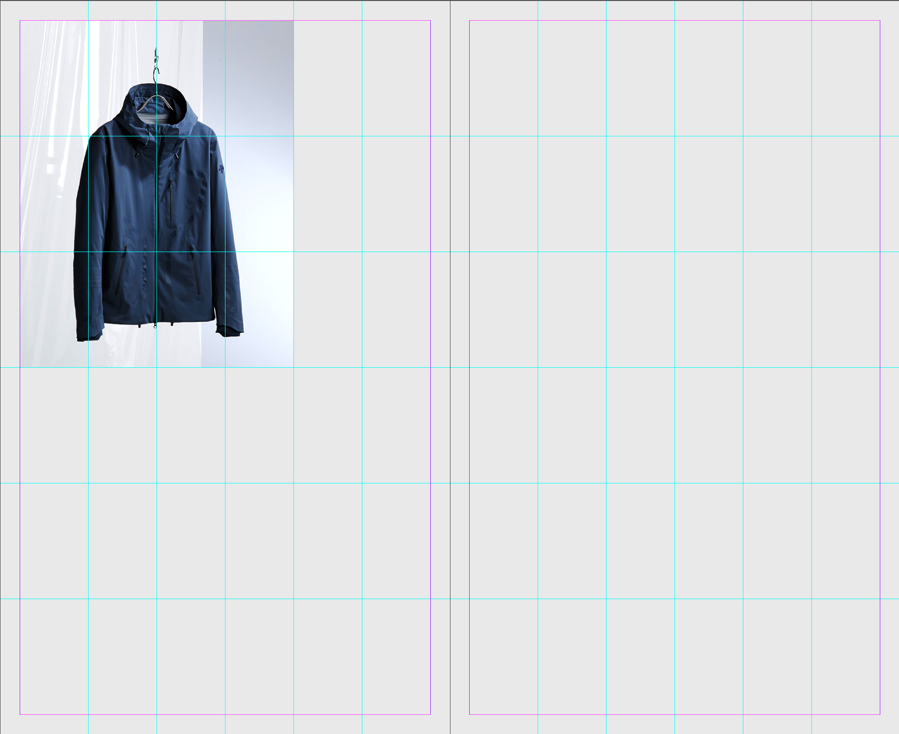
Light grid visible to clarify element position. Superimposing the grids
Overlaying the two grids provides us with a dynamic, playful athmosphere that still manages to provide clear emphasis on particular images that convey our brand message.
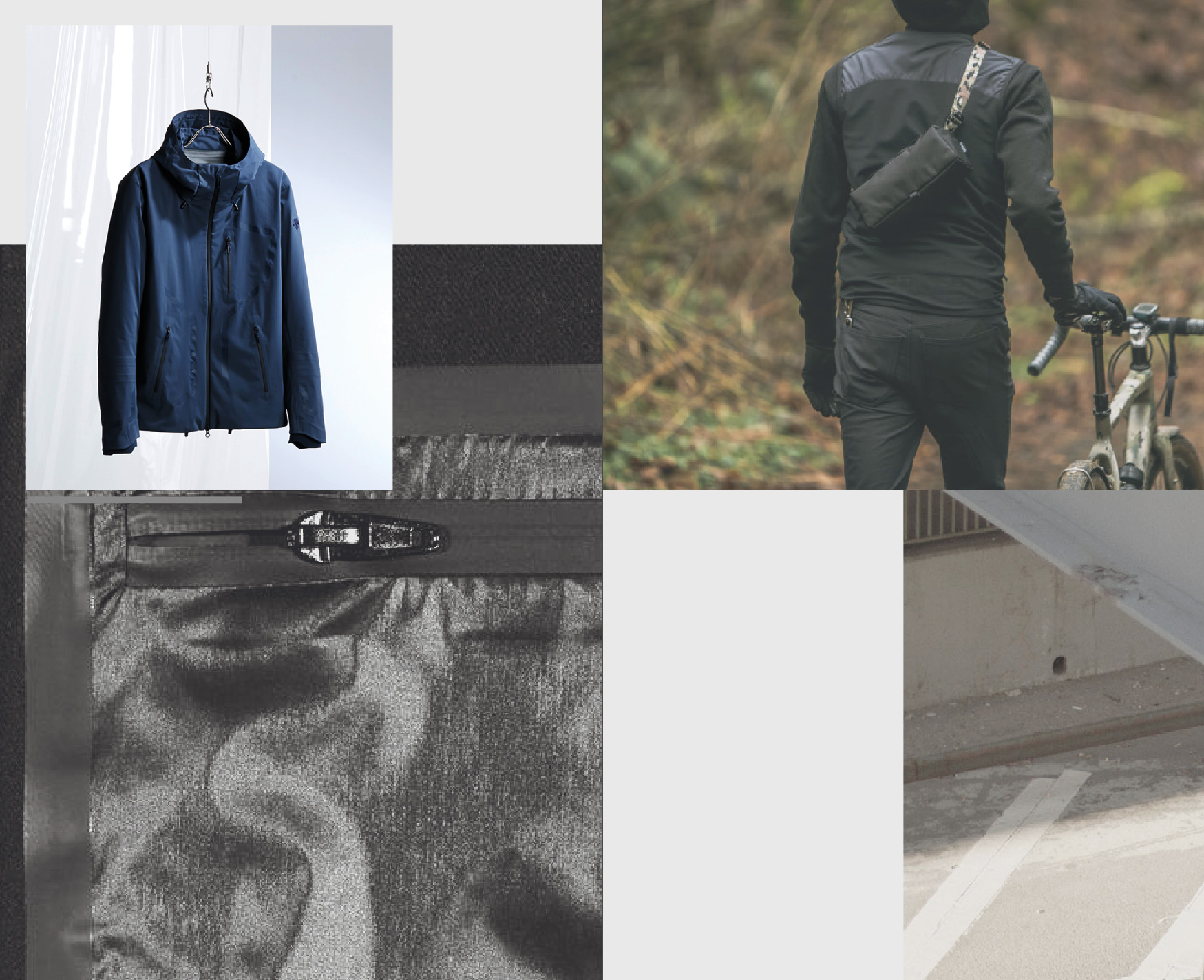
Shadow and Light layouts superimposed on top of each other. Note how the single image placed within the Light grid separates itself from the background. 
Both Shadow and Light grids visible to clarify element distribution. Adding text
Combining the light and shadow grids with our simplistic typography leads to monumental, vaguely architectural layouts that strike a delicate balance between clarity and volume. The impression draws from distinctive contrasts in font sizes as well as contrasts between imagery and typography. Finally, the structured arrangement of elements in the grid(s) leads to attractive tension in white spaces – created from the negative forms of the assembled elements.
-
Layout for small formats^
As pointed out above, using the grids is not a requirement for all formats. For extremely small formats, using the grids would hurt more than it helps. In these cases, employing measured judgement to emulate the look is the best way forward. This may include setting single images to bleed to one or two document edges, overlaying images or emulating the relationship of the two grids to define balanced placements for typographic elements.
As an example, no guidelines are defined for visual social media posts. Instead, the layout mood is translated to small formats by creating simple arrangements that work for both the detail post view and the grid overview.
-

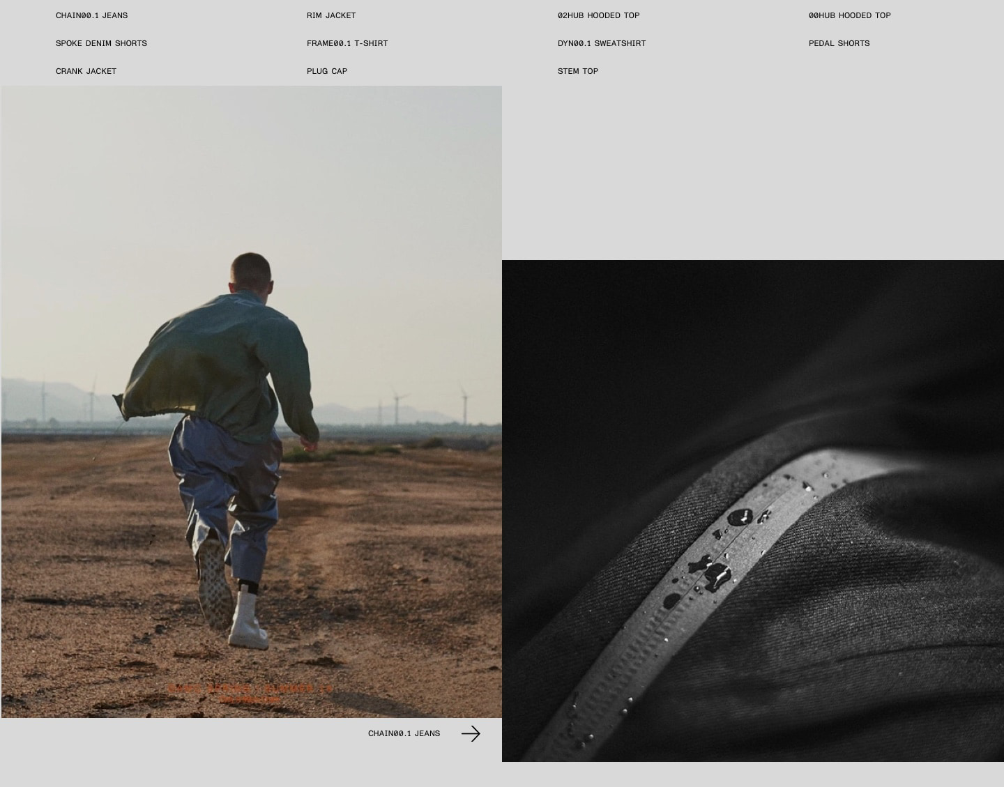
Sample layout to be used for Instagram posts.
Sample layout to be used as Facebook header. -